Admin Shared Features
There are a few things to know about the interface that aren't specific to any one tab.
Bulk Editing
Bulk editing capability is available for Pages, Mailings, Reports and Events.
The actions that you can perform in bulk vary by the object type.
For Pages, you can hide pages, show hidden pages, add and remove tags from pages in bulk.
Hiding a page disables it. If a user goes to the URL for a hidden page, they’ll see a “Sorry, the URL you tried to load doesn't exist” error. This is true for all hidden pages, whether they’re hidden individually or in bulk.
Be especially careful hiding unsubscribe pages. If the unsubscribe page is used in one of your mailing wrappers, your mailing may fail and in any case, the page won’t be reachable, leading to irritated users marking your mailing as spam and quite possibly cats and dogs living together.
For Mailings, you can show hidden mailings, add and remove tags from mailings in bulk.
For Reports, you can hide reports, show hidden reports, add and remove categories from reports in bulk.
Minidash reports are a special case - you can hide them, but since those reports display on your primary tabs, we use them whether or not they’re hidden.
For Events, you can approve, confirm, delete, make private, and make public multiple events at once from the event list screen.
Step-by-Step
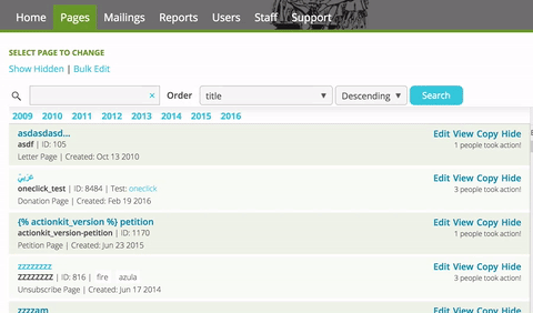
To bulk edit:
1 From the Browse All screen (or from the Event List screen for events), click on the “Bulk Edit” link in the top left next to “Show Hidden”.
2 Choose the items that you want to apply the action to -- you can click to select specific items, or select all items visible on the screen.
3 Click the Save button, review the count of objects to be changed, and confirm.
You’ll then see a reportback with the number of changes actually made. This may differ from the preliminary count if, for example, an object you try to apply a tag to already has that tag.
Custom Fields
ActionKit supports five different types of custom fields: page, templateset, mailing, user and action.
Custom fields allow you to extend various parts of ActionKit functionality.
For example, a custom page field could be used to set a secondary goal so a page's thermometer automatically increases the goal if the original goal is met. And a custom templateset field could set the header logo image for a given templateset. And a custom user field could hold the employer information for a given user.
Action fields are different from the others however; they are associated with the specific action taken on a page. Survey pages use this field type to record responses to each question. Letter and petition pages save the user's comments in an action field as well. Unlike the other fields, they do not need to be set up in advance of being used.
User fields are also slightly different in that any choices you make about the default or content type only apply in the admin. They do not affect the field when it's displayed to end users as part of your user form.
Page Fields
Custom page fields are a powerful and flexible tool that allows you to add a section of content or code to an individual page.
For example, if you want to ask users to tweet about an action they've taken, you could add a page field called "twitter" and include a suggested message specific to the page. If you have a Protect Parrots petition your sample message might be "Parrots are smart. I just signed to save them here: action_URL"
Page fields you've created are available on the Action basics screen for each page.
Note
If you don't see a Page fields section on this screen, no custom page fields have been created for your organization.
Use this syntax to include page fields in your templatesets or to reference them when creating a page: {{ page.custom_fields.YOUR_FIELD_NAME_HERE }}. Or, if your custom page field contains template tags or filters that need to be interpreted, then use this syntax instead: {% include_tmpl page.custom_fields.YOUR_FIELD_NAME_HERE %}.
Templateset Fields
Templateset fields are a type of custom field, like custom page fields or user fields. They're associated with the templateset and allow you to make templateset-specific customizations.
For example, if your site used a few different templatesets which were mostly similar but used different colors, you could define a custom templateset field for heading color, and reference it from within your template code. You could then copy the templateset and choose a different color without making any changes to the code.
Templateset fields you've created are available on the Settings screen for each templateset.
Note
If you don't see a Custom Templateset Fields section on this screen, no custom templateset fields have been created for your organization.
Mailing Fields
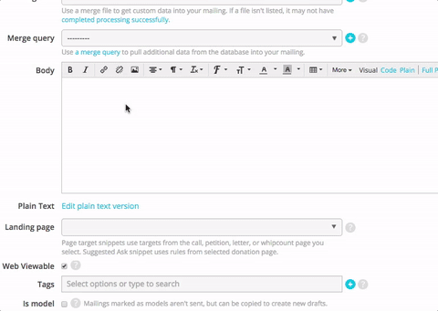
As with custom page fields, you can use these fields to insert a section of content or code in your Mailing or Email wrapper, or to create a mailing template.
After you've created the custom Mailing Field, add the field to the body of your Mailing using this syntax: {{ custom_fields.FIELD_NAME }}. Or, if your custom Mailing Field contains template tags or filters that need to be interpreted, then use this syntax instead: {% include_tmpl custom_fields.FIELD_NAME %}.
Then in the custom field row toward the bottom of the screen, select the field name on the left and enter the value on the right.
User Fields
A custom user field is used to store information about a user. A custom user field defaults to allowing one value; the old response is overwritten every time the user submits a new response. When a custom user field does not allow multiple values, the value will always be overwritten by a user action, in the admin or by import.
Action Fields
Custom action fields are assigned to each action. They are often used to hold the results of survey questions. They don't need to be setup ahead of time. Just adding a form field that starts with action_ is enough. For example, you could add the following to a sign up page to allow users to enter their mood when they signed up:
Your mood today:<input type="text" name="action_mood">
Responses are recorded in the core_actionfield table.
Event Fields
Event host forms can include custom action fields. Action fields created in the User Form Fields section on the Edit Content screen are displayed under Your Contact Info on the page. Those created in the custom field HTML box are displayed under Event Info.
The values for action fields added through event host forms are stored in core_actionfield and events_eventfield. You can access them from the event creator's user record or from Download Actions on the Reports Tab.
Custom Field Options
Display Name
This is the pretty name that will show when adding fields to a page, templateset, or mailing. You can use spaces, punctuation, etc. It can be changed in the future.
Name
For internal use. This name cannot be changed later and can only include letters, numbers, and underscores (no spaces or other characters).
Always Show
If checked, this field will always be displayed as an option, anywhere the fields are displayed in the admin.
Description
This provides help text that displays below the field.
Field Type
You can set a content type for custom fields which will provide different input options and validations for different types of fields.
Available types are:
- Text: Auto-expanding text input field with a "max length" option to address one of the most common validation patterns.
- Select From List: Provides a select menu for campaigners.
- Select From List With Other: Same as above, plus an "other" choice that reveals a text input field for free entry.
- Integer: Only accepts numbers, and also provides up/down arrows to increase/decrease the value.
- HTML: Uses our standard visual editor with code/plain options. Note that the contents of this field will render as text unless autoescape is off.
- Web address URL: Input field with validation for HTTP or HTTPS URLs.
- Image address URL: Type-to-select that displays matching options (with thumbnails!) from your media library. You can also enter a a web address.
- Color Hex Code: Provides a color picker or campaigners can type in a 3- or 6-digit hex code.
- Date: Displays a calendar widget for entering dates in year-month-day format, like 2019-12-31.
- Date and Time: Displays a calendar and scrolling time widget for entering dates and times in year-month-day 24-hour format, like 2019-12-31 23:59.
- Time: Displays a scrolling widget for entering times in 24-hour format, like 23:59.
Field Default
Set a default value that will pre-fill the field.
Field Choices
Available only for Select From List and Select From List With Other field types. Enter select options one per line. You can use an equals sign to separate a short database code from a user-readable label, like "Y=Yes".
Field Regex
Available only for field types that include a text input. You can provide a regular expression to validate campaigners' input here. For example, the regular expression [0-9]+ will only match unsigned integers. Regular expressions must match the full input - use .* to match arbitrary input. Regular expressions are compiled in Python, see https://docs.python.org/2/library/re.html#regular-expression-syntax.
Field Length
Available only for Text and Select From List With Other field types. Add validation for the maximum number of characters; leave blank for unlimited.
Emoji and other non-ASCII characters
You can use emoji in most fields in ActionKit. If you are using the HTML visual editor, they will be converted into an HTML entity escape sequence like "🐄" or "🐄" in the database. You'll see them in the HTML entity escape sequence when viewing in code or plain mode. The rendered page or mailing displays the emoji as does visual mode.
Similarly, if you use non-English languages and the HTML visual editor, characters like "é" may be saved as "é"; in the database. They still display correctly to your end-users.
Help Links
The question marks throughout the admin interface link to the relevant section of the user guide.
Hide And Delete
Most data in ActionKit cannot be easily deleted, but can be hidden. Some objects that can't be deleted from the admin can be deleted using the API.
Objects you hide don't show up in a search or object list. For example, if you hide a mailing it won't show up on the browse all mailings screen or in the list of mailings you can include or exclude when you're selecting recipients for a new mailing.
When an object is hidden it is also disabled. For example, if you hide a page, users will not be able to submit on that page. Be careful not to hide objects that are currently in use.
You'll be asked to confirm that you really want to hide some objects, like pages, as a safeguard against accidentally hiding something that is in use.
You can unhide an object by going to the list for the object type. From the Mailings or Pages Tab, click "Shown hidden" to see the hidden objects. Select the "show" link for the mailings or pages you want to unhide.
Searching
Multi-word searches look for each word independently, rather than as a single phrase. For example, searching on the Pages Tab for Trump Call will find a page named "Call To Impeach Trump." You can still look for phrases with words in a specific order by enclosing them in double quotes. For example, searching the admin for "Support Racists" would match a page named "Don't Support Racists" but it would not match a page named "Racists Support Trump" because the words are not present in the same order.
Searchbox
The admin searchbox can help you quickly find the parts of ActionKit that you need. It's included on every page, at the top right of the screen.
Initially, when you type in the searchbox, matching Pages, Mailings, Reports, and Users are suggested, provided you have the necessary permissions.
From there, you can select one of the suggestions. Or for a more specific search, click the toggle arrow and choose a category such as Pages + or Users +. The category groups include related models, so searching the Pages + category will suggest TemplateSets too.
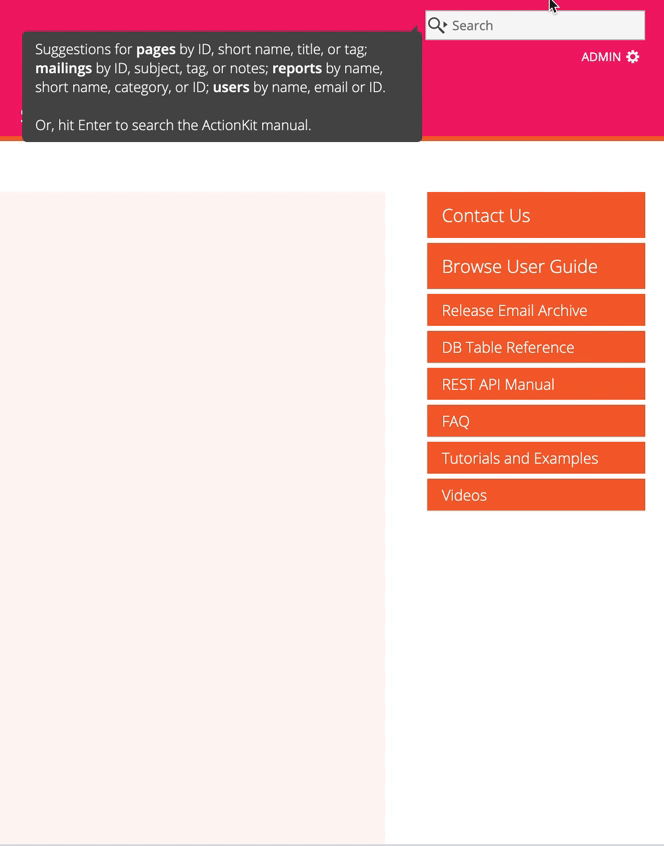
There's a limit of 5 suggestions per object type for your search term. When there's more than 5 matches, click "See Exact Matches" to do a full search for your search text and see all the matches.
You can also hit enter to be taken to the familiar full page search. By default, hitting Enter runs the search associated with your current tab. So from the Mailings tab, if you type your search term and hit enter, you'll be taken to a search of mailings. If you've selected a different category for the searchbox, such as Users +, hitting enter will run a full user search.
Unique Identifiers For Each Data Type
Every data object you create, like a tag or a templateset or a language, has a unique id in the database. Sometimes you'll want to use that id, for example in a SQL query. If the id isn't listed on the admin screen you can usually find it by clicking on the name of the object and looking for the number in the URL.
For example, if I want to find the id for a tag, I follow the link to Tags on the pages tab. Then I click on the name of a tag. The URL of the Change Tag page looks like this: http://docs.actionkit.com/admin/core/tag/10/. The tag I selected has an id of 10.
WYSIWYG And Code Editor
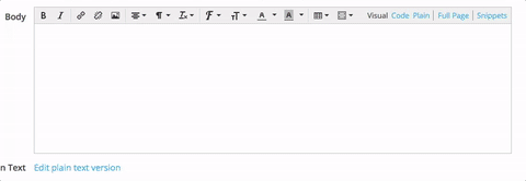
Most everywhere that you can enter and edit text (e.g. page content text boxes, mailing body), we've provided a basic WYSIWYG editor (TinyMCE) and a syntax coloring editor (CodeMirror) as well as the standard browser text area.
- Select Visual to use the WYSIWYG editor and view the rendered content without writing your own HTML. The toolbar has buttons you can use for standard functions and formatting. Just hover over the tool to see the name. For example, you can click to indent a paragraph or to insert an image. The show/hide toolbars button opens a second bar with additional formatting options.
- Select Code in the toolbar to have color-coding and line numbers for easier editing of the code. Different elements, like Javascript or CSS, are given different tinted backgrounds or text colors.
- Select Plain to remove all highlighting.
Note
The visual editor, like other WYSIWYG editors, may at times add more than you expect to the HTML, like extra <p> tags, and at other times, strip out things, like styling. You may want to avoid the visual editor when updating code-heavy items such as mailing wrappers and templatesets, and limit the use of the visual editor to areas that are more content-heavy, like page text and mailing body content.
Spell Check
We've made it possible for you to enable your browser's native spell checking when using the WYSIWYG visual editor, at least for most major browsers. The keyboard shortcut, menubar command, or context menu option required to enable spell checking is different in each browser, but typically you can right-click (or control-click, or two-finger-click) on an editor panel to reveal the 'Spelling' or 'Spelling and Grammar' commands for it. Firefox users may have to begin by selecting 'Install Dictionary' to enable spellchecking the first time, if they have not already done so. This enables 'check spelling as you type' functionality in Mac Safari, Chrome and Firefox as well as possibly Windows for Chrome, Firefox and IE 10+.
Visual Editor Image Features
The visual editor supports a number of features to make it easier to add and edit images on your pages.
To add an image for which you have an existing web URL, click the image toolbar button and enter the URL in the Source field.
Once an image has been selected, you can use the height and width fields to adjust the display dimensions, or click on the "Advanced" tab of the image panel to add a margin or border.
If you have configured an Amazon S3 account to act as the storage for your media library, several additional features will be available.
To select an image from the media library, click the "search folder" icon to the right of the source field, and the select the image from the list. You can search for files by name to narrow down the listing.
To upload a new image to the library, drag the image file into the visual editor, or copy the image and paste it into the editor.
To edit an existing image, click on it and then look for an extra toolbar that appears immediately above or below the image. This contains buttons to flip and rotate the image, as well as one that opens an image editor panel. The image editor panel includes tools for cropping and resizing the image, as well as making various types of color adjustment. A modified version of your image will be uploaded to your media library without overwriting the original.
Dates
ActionKit stores all dates in GMT. You can select a display time zone for your log-in that will translate these to your preferred time zone. This is for display only. The times in the database will still be GMT.
If you are using ActionKit reports or pulling data out using MySQL, you can use the convert_tz() function to go from GMT to whatever time zone you'd prefer.